Monday, November 23, 2009

Sustainable Innovation


On November 18th, Nathan Shedroff presented a lecture about sustainability in design at the University of California, Davis. His lecture primarily focused on the importance of merging the very different worlds of design, business, and sustainability.

According to Shedroff, sustainability is often a mix of ecological, social, and financial ideas that need to be incorporated into design. Shedroff stated that although “there is no such thing as sustainable design, there is such a thing as more sustainable design.” Throughout the lecture, viewers were graced with valuable information about creating and selling sustainable products. Design strategies for making efficient merchandise encouraged designers to create usable, accessible, and meaningful products. Shedroff also mentioned the benefits of using local resources, substituting wasteful materials like plastic with recyclable ones, and design for durability. By following these guidelines designers will never run into problems like Shedroff’s biggest pet peeve, “designing things today that will make tomorrow worse.”

At the end of his lecture, Shedroff presented six tips for sustainable innovation:
1. Provide more for less
2. Focus on efficiency and health
3. Use and promote local energy, resource, and labor
4. Don’t use (American) PVC
5. Design solutions to be savored
6. Don’t spend more declaring your results than the value they provide

Designers ultimately create the future, so it is incredibly important that they incorporate sustainability into their design process. Sustainable innovation is not only important for designers now, but designers in the future. Because consumerism has drastically increase and will most likely continue to do so, it is up to designers to create efficient products that will benefit the environment and society.

Objectified


In the film Objectified, director Gary Hustwit reveals the designer’s role in the relationship between humans and industrial mass production. Although the goal of industrial design is mass production, designers invest a lot of time in making sure a product is ideal for the consumer. Designers from companies all over the world discuss the thinking and process it takes for them to create a successful product.

Objectified specifically takes a look at the design process for items that are used in our everyday lives; objects one would never think were so thoughtfully designed. The film shows how a simple object such as a potato peeler is intensely researched and thought out to maximize the products utility. The designers discuss their inspiration (in this case a bike handle) as well as the steps taken in order to simply make a prototype. One designer states that “good design is as little design as possible,” the practical objects that we use regularly are designed for simplicity and efficiency, not for show.

Objectified portrays Apple as an ideal company who “takes design seriously.” Apple products are resourcefully made and are sustainable for mass production. Apple’s straightforward design is also economically practical because it efficiently uses almost all of its parts. Along with having incredible consumer friendly products, Apple is able to use its resources wisely.

When looking at design overall, Objectified evaluates the form, symbolism and context of a product. Objectified helps society understand how even the most minuscule of objects is carefully designed for a purpose.

“An artist is somebody who produces things that people don't need to have.” - Warhol


In the spring of 2009, deYoung Fine Arts Museum held the exhibit Warhol Live which featured the work of the infamous pop artist Andy Warhol. The exhibit beautifully blends Warhol’s pieces with the music which inspired his style of pop art. Warhol’s use of bold colors and focus on popular culture are defining characteristics of his work, which will forever be recognized in society.

The exhibit follows Warhol’s career and his journey in becoming a legend in the artistic world. The focus of the exhibit is Warhol’s work from the late 1950’s to the early 80’s; as one travels through the show, the music reflects the time period. Upon walking into the exhibit, Warhol’s early work from the 1950’s (a lot of advertisements) is on display while songs from Elvis Presley play softly in the background. As the exhibit advances, different rooms and music help portray the time period the art was created. Warhol’s eccentric and bright silkscreen works from the 60’s and 70’s correlate perfectly with the rock n’ roll music of the Rolling Stones and Michael Jackson. It is during this time that Warhol’s most notable works of Marilyn Monroe and other famous musicians and celebrities are on display. One room is specifically dedicated to Warhol’s notorious four panel, multicolored silkscreens of various pop figures. This collection of paintings defined Warhol as a true pop artist.

While walking through the exhibit, one discovers a unique collection of Warhol’s art, as well as learns about the fascinating life of the artist himself. Personal stories about Warhol and his journey as an artist are revealed through commentary from the museum and Warhol himself. Quotes from Warhol and his ideas about art and life are presented in large text on the walls of the museum. Overall, this exhibit is breathtakingly beautiful, fun to look at and listen to, and gives one a look into the life of the infamous artist Andy Warhol.

Food & Design


With Thanksgiving on its way, it is difficult to concentrate on anything other than food. Although food and design seem to be a far fetch, they really do have a lot in common. After watching a good three hours of Food Network, the combination of food and design mirrors the pure perfection of peanut butter and jelly.

No one wants to eat something that is not visually appetizing, so designs role in food presentation is major. The physical appearance of food is equally important in restaurants and in home cooked meals. Alton Brown from Iron Chef America says that a plate of food is like a painting; chefs need to think like a designer in order to present their food in an appetizing manner. The plate is like the frame, and the food is the composition. Color, texture, and shape are just as important in a plate of food as they are in a painting.

On the show Food Network Challenge, different pastry chefs compete to create a birthday or wedding cake for a specific client. Each chef must transform into a designer when laying out the structure and idea for the cake. The shape of the cake must be determined, as well as the colors and motifs in order to decorate it. Chefs must take the clients preferences into consideration, as incorporate their own style and creativity into the design. Color is a key factor in making the cake look unique yet appropriate for the occasion. Similar to designers, pastry chefs must use the design process of thinking, looking, and doing in order to create a cohesive and yummy masterpiece of a cake.

Food presentation is all about creativity and unity. Along with balancing flavors, chefs are also responsible for balancing color, texture, and proportion of a dish. Like design, simplicity is key in presentation, too much clutter on a plate is equally as disturbing as a messy room or a busy painting. Successful chefs must not only be great cooks, but great designers.

The Emotional Rollercoaster of Color


One would never expect that something as simple as color can evoke emotion. Although responses to color may vary, the fact that almost every human being can relate to color is truly amazing. From public buildings to home décor, color is a constant subject one encounters on a daily basis.
The ARC at the University of California, Davis is a perfect example of a communal facility in which color suggests a sensation. The ARC is a gym where students and residents of Davis go to exercise and escape the stresses of school or work. There ARC is in some way a sanctuary to many, so its design must reflect the idea of peace and serenity. The color scheme used in the ARC uses cool tones in order to achieve a calm environment. The locker rooms are painted with sky blue’s and mint greens, with off white tile and sleek stainless steel appliances. Color harmony is achieved by used an analogous color palate, so the overall design of the locker room looks cohesive while evoking a sense of tranquility. The exercise rooms also follow this cool color scheme, but use darker hues with greater value such as forest green and plum. This makes the atmosphere seem relaxing, but differs from the spa-like feel of the locker rooms. Overall, the ARC ambiance promotes a stress-free lifestyle and color helps to accomplish this attitude in its members.
Color choice in homes also plays in important role in emotion. Bedrooms are often cool tones to promote a relaxing atmosphere, where as living rooms and dens are often warm tones to create a cozy and welcoming environment. Rich reds and browns, and bright oranges and yellows are common in living room color schemes because they suggest an “intrinsic feeling of warmth and evoke warm, happy, cheerful reactions.” (Lauer, 283) The living room is the area of a house that guests most likely see, so it makes sense for one to use inviting colors.
Whether we notice it or not, color affects us all psychologically. Usually the subconscious mind notices color, and the conscious mind helps us experience it. Color is important to both the physical eye and the internal emotion.

¡Barcelona!


Barcelona, Spain is a city filled with impeccable design. The architecture of the city as well as its creative inhabitants makes for an aesthetically pleasing experience in a wonderful foreign city.

Sprinkled throughout the city are the stunning works of Antonio Gaudi. One of his most noted masterpieces is La Sagrada Familia, which he spent ten years designing and never actually completed. This giant cathedral sits in the center of the city and is a main attraction for tourists and the Catalan people. La Sagrada Familia is undeniably beautiful and extremely unique to the style of Gaudi. The church has been under construction for over one hundred years in attempt complete Gaudi’s design. Gaudi’s inimitable take on gothic design throughout Barcelona makes the city even more of a brilliant place to visit.

La Rambla, the center street of Barcelona, is filled with the design of Catalan inhabitants. Filled with restaurants, shops, and street performers, la Rambla is a multisensory experience. Street performers creatively find ways to make a buck or two by dressing in outrageous costumes. At first one might not consider these performers designers, but the thought and process that goes into their act are mirror images of design. For example, one performer on la Rambla designed a costume that looks like a golden statue with wings that reach almost nine feet tall. Every day, she assembles her costume and paints her body completely gold to portray this angel like figure. As a designer, she made her own choices about color, shape, and texture of her outfit, as well as the message she is trying to portray to her audience.

Barcelona is a city filled with art and culture (and extremely delicious food), which makes it so unique to any other place in the world. The Catalan society as a whole is very involved and proud of the Barcelona’s artistic nature. Many designers travel to Barcelona to look for inspiration and learn about culture and beautiful design.

Monday, November 2, 2009

Warm Thoughts


The Richard L. Nelson art gallery at UC Davis is currently holding an exhibit on African American quilts. The obvious purpose for a quilt is to keep one warm, but this exhibit portrays that quilting has another purpose: artistic expression. Sharecropper’s Masterpiece quilted by Mensie Pettway is an example of how a quilt not only kept a family warm but enabled a woman to express herself through the art of quilting.

Sharecropper’s Masterpiece is a made from scraps of cotton batting, cotton corduroy, and hand dyed muslin. Organized in a variation of a checkerboard grid, this quilt uses continuity in order to create unity with a busy pattern of assorted colors and textures. The rhythm of this pattern is based on a repetition of color with alternating direction of line in the different modules of the checkerboard. The viewer’s eye is carried easily though the quilt because of the uniform pattern of varied repetition, creating a smooth visual sensation.

Because this quilt is nonobjective, meaning the art is not representation of a figure or object, it is “capable of producing an undulating rhythm” (Design Basics, 114). The quilt has a staccato pattern which means that it makes sudden changes with vibrant contrast. The quilt changes from vertical lines to horizontal lines in every other module, but sticks with same color palette in order to keep unity. Sharecropper’s Masterpiece also has an alternating rhythm in which the design changes consistently in order to create a customary sequence. The pattern becomes predictable, but still keeps interest because of varying direction.

Sharecropper’s Masterpiece, like many other quilts in the world uses pattern and rhythm to create visual interest, as well as uses scraps of materials to produce a cohesive design. Quilts are not only for the function of heat, but for artistic expression and visual stimulation.

Sunday, November 1, 2009

A Symbol for Change


In the 2008 election for presidency, candidate Barack Obama used a wide variety of campaigning tools which eventually led him to victory. A common symbol Obama used during his campaign was a sun rising (see picture at right), and this symbol will continue to represent him throughout his time in office and beyond. Through Peirce’s study in semiotics, one can assume that this symbol is now directly associated with Obama, regardless that it looks or says nothing about him.

The silhouette of the symbol is an O, which alludes to the O in Obama. The rising sun represents a new day, or for America, a new beginning. Obama’s intention for the design was to evoke a sense of renewal and suggest a rebirth of America and its policies. The color used in the design was obviously red, white, and blue; although Obama’s logo used a lighter blue and a brighter red which makes the design look more playful and fresh.

In order to create unity, the symbol plays with continuity. The blue sky and the red land form a perfect circle, the eye is “carried smoothly from one form to another” making the overall shape of the design look cohesive (Design Basics, 38). The negative space in the logo ties the design together, as well creates the effect of the sun and gives dimension to the land. The red and white stripes, which allude to the stripes on the American flag, appear to extend through the design and continue effortlessly onto the white background.

Overall, Obama’s symbol ties together the American flag and the idea of a new beginning. Together, these two suggestions create a visual reference to Obama’s ideas about change.

Take Me Out to the Ballgame!


The design of every major league baseball field is almost always the same: four bases, a pitcher’s circle and mound, dirt in the infield, and grass in the outfield. What is unique and important about a stadium are the components encasing it. What makes a stadium truly special to visit is not the actual field where the game is played, but all elements surrounding the field. Baseball and America go hand in hand, so a field not only represents a sport but a true American tradition.

Each stadium across the United States design is undeniably beautiful and distinct to its city. The Boston Red Sox’s Fenway Park opened in 1912, and still remains a classic with its well-known wall, the Green Monster. The Green Monster is a 37 foot wall in the left field of Fenway, where the only manual scoreboard left in major league baseball is mounted. The wall is the focal point of the stadium because of its extreme proportion in relation to all other fields in the United States. Although the wall is a defining characteristic, the design is very impractical for a baseball field because it prevents many homeruns and is extremely problematic for left fielders.

In contrast to Boston’s classic field, New York’s Yankee stadium is brand new and filled with glamorous restaurants and high tech gadgets, and holds up to 52,000 people. The original stadium which sits across the street held many great memories for the Yankees, so designers brought elements of the old into the new. The salient lattice work from the old stadium was recreated and put on the roof of the new stadium. The interior of the stadium has thousands of photographs portraying Yankee history which raise spirit and bring nostalgia to Yankee fans. The photographs in the new stadium are important because they remind fans of the strength of old Yankee players and tradition.

Every stadium design, new or old, has its own charm and character. The importance of design in baseball fields helps fans distinguish a special trait in their team’s stadium to be proud of. Whether it be a giant Coke bottle like the San Francisco Giants’ AT&T Park or a big bell that lights up for homeruns in Philadelphia’s Citizens Bank Park, each design in uniquely important to a team’s fans and its players.

LOVE


Almost every night in the Mirage hotel in Las Vegas, hundreds of people go to see the Cirque du Soleil show LOVE. About the journey of the popular rock group the Beatles, LOVE uses acrobatics, music, and vibrant color to evoke a sense of the 60’s and show stories through the Beatle’s songs.

Before going into the theatre, one can immediately get a sense of the show, even if they have no clue who the Beatles are. The walkway into lobby is made of board tile LED lights which change colors in a wave-like effect. The rest of the lobby is all white and very modern with clean lines and simple architecture. Because the majority of the lobby is very simple, it allows the eye to concentrate on the floor feature, which is essentially the focal point. The floor even extents to a half wall where there is a silhouette of the four Beatles jumping in the air. The floor leads the eye down the path of colors all the way up the wall to showcase the picture of the Beatles. This light feature perfectly defines the essence of the LOVE show with its’ bright colors and rock n’ roll vibe.

The actual show of LOVE is almost indescribable. The overall design for the show could be easily stated as organized chaos. Flamboyant and intricate costumes combined with an incredibly colorful set design are almost overwhelming. Along with music that fills your heart with happiness and astounding acrobatics, watching the show feels almost like one is on a mindboggling drug trip. Every sense must be utilized while watching LOVE because there is so much color, sound, and action to take in. One might even get lost in the show and feel as if he or she is in another world. Because the design elements are so overpowering and bold, LOVE becomes more of an experience and a journey than just a story.

Monday, October 26, 2009

Peter Max


Peter Max is what one may call a genius of color. Almost every one of his paintings and designs are filled with an array of bright, loud colors which are shouting for attention. Max, whose work ranges from politics to music and sports, uses color to emphasize and enhance the item which he is painting.

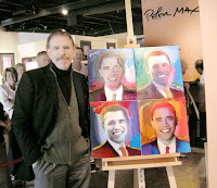
In one of his newer pieces “Obama 44”, Max painted 44 portraits of Barack Obama in multi-colored panels. The piece, which honors America’s 44th president, looks Andy Warhol-esque with multiple panels featuring the same picture but with the varying element of color. Max is able to create unity through varied repetition in this painting by using variations of color on a constant theme of portraits of the same person. Max’s painting is fun yet remains aesthetically pleasing because of his differentiating color scheme.

Max also uses a grid as a tool for organizing a framework for his painting. Max’s grid has the underlying feeling of a checkerboard; the 44 portraits are assembled into four rows and ten columns, creating an overall rectangular shape. The unpredictable rhythm of color gives interest to the organized and simple layout of the painting. Because an individual portrait of Barack Obama may seem ordinary, Max uses a variety of colors and a multitude of paintings to create attention and invite the viewer to look more closely at his piece. “Obama 44” is a great example of visual unity because the whole piece predominates over the individual parts. Although when one looks closely, he or she can appreciate the uniqueness and quality of each portrait.

Peter Max, like any designer, effectively knows how to achieve unity in order to create visually pleasing and remarkable works of art.

Wednesday, October 21, 2009

Copyright of Copywrong?


In the reading The Etemology of Design, author Kostas Terzidis argues that “the notion of design…is associated with the past instead of the future.” (p.72) Designers often look to already existing items for inspiration, transforming and building off of what already exists to create something of their own.

In the film Free Culture, creator Lawrence Lessig discusses how copyright laws have become an issue to designers all over the world. Lessig contends that copyright laws slow down culture from changing. Almost all forms of media, especially images, are under copyright laws which forbid any other person besides the owner from using the material. Congress has now extended copyright to 70 years beyond the lifespan of a creator, making it extremely difficult for designers to keep up with the times and improve things happening in the now. Disney, a very influential corporation, has become a pioneer for copyright laws. Every time the copyright on Mickey Mouse is close to expiration, Congress extends the copyright allowing Disney to hold on to it’s trademark character. These laws have made it so Mickey Mouse and all of Walt Disney’s creations are impossible for a designer outside of the corporation to improve on. Because Disney is so influential in society, designers are held back from impacting a large scope of people.

Creativity and innovation build on the past. When designers are not allowed to temper and improve on past ideas, they are held back. When designers are held back, so is society. Designers are crucial in order to help society change and improve. When held back by laws, the designer’s potential to advance and better the world is hindered greatly.

Wednesday, October 14, 2009

Mamela


The design process requires more listening and learning than it does creating. In order to be a successful designer, one must have an open mind and accepting attitude when working with others.

In the working world of design, a designer usually has colleagues, as well as multiple clients. It is crucial for a designer to listen to client’s needs as well as the suggestions and criticisms of the designer’s team. If a designer proceeds to do this in his or her career, he or she will be extremely successful.

By listening carefully and collaborating with clientele, the designer can effectively grasp and execute the client’s idea. Although the final product may not be exactly what the designer thinks is best, the client is happy, which is what matters in the end. A designer must also look to his or her colleagues for guidance and feedback. An outside point of view or a critique is beneficial to any designer. Advice and evaluation from others can lift a designer to reaching a point in his or her work that is beyond expectation.

Julie Taymore, the award winning designer of The Lion King musical, understands the importance of listening to others ideas, as well as your own. In an industry needing hundreds of people to put on a production, Taymore learned to utilize her team in order to create an award winning masterpiece. A current theme throughout the incredibly designed musical of The Lion King is listening to the guidance of others. The South African Sesotho word “Mamela,” which means to listen, is used continuously in Taymore’s songs. It is possible Taymore was inspired by her own experiences as a designer, and incorporated them into her beautiful portrayal of The Lion King.

Applying McCloud’s 6 Steps of Design


In Understanding Comics, author Scott McCloud presents six steps that are involved in the design process:
1. Idea/Purpose
2. Form
3. Idiom
4. Structure
5. Craft
6. Surface
It is easiest to understand these six steps by using an example, for instance, a glass vase.

First, the designer’s idea to make a vase derives from a purpose, say, needing a place to put flowers. Once the purpose has been established, one can move to the second step of form. The designer then makes the decision of what materials to use, in this case that material is glass. Third is idiom, or the genre; will this glass vase be modern or baroque? Once the style is decided, the designer begins the process of “mark making”, or designing the glass vase. The shape of the vase will be determined by the idiom, as well as the first and second steps of the idea and form. Next is crafting, blowing the glass to its designated shape, color, form and texture (all which were thought out in pervious steps). Lastly, the surface; the finished product, the glass vase itself.

While reviewing the steps of the design process, one can say that the individual decisions within each step pave the path for the next step. It is not possible for a designer to skip steps within the process of design. An excluded step can and will result in an unfinished product. This does not mean that designers do not rearrange certain steps or come back to previous steps if necessary. The flow of the design process is up to the individual designer, ultimately doing whatever he or she feels is natural in order to be successful in the journey of design.

A Designer’s Greatest Muse is Simply, Nature


What better inspiration can one find than the natural elements surrounding his or her environment? Nature’s possibilities are endless, so designers should take the opportunity to explore the diversity of the natural world, for “looking is the primary education for any artist.” (Lauer, 15). Not only can a designer seek organic guidance from plants and animals, but in inanimate objects such as the weather or geography.

Sculptor Henry Moore has clearly grasped the idea of looking to the environment for inspiration. While taking a stroll on a beach collecting seashells, Moore found a shell that embraced the idea of his existing sculpture of a mother holding a child. Although his work is similar to the shell, it is nowhere close to being a duplicate. A designer takes the insight nature provides, then contorts and guides that inspiration into his or her own unique piece of work.

A designer should look closely and carefully at their surrounding environment, for even the smallest details can provide a wide variety of thought. Objects that are routinely seen often go unnoticed, yet they have just as much potential. A designer should be constantly aware of his or her surrounding elements; as attentiveness increases, so does capability to create.

Sunday, October 11, 2009

Design of a Fine Wine?


Upon visiting Moraga’s Amaroma Restaurant, one can see the enormous display of wine bottles that take up an entire wall of shelving. How is a person to pick a wine when there are over two hundred options, all fair priced and all said to be delicious? The answer is simple, the label.

The physical presentation of the wine bottle is almost as important as the wine itself. A great label draws the eyes attention to that particular bottle, making the wine more prominent than the hundreds around it. Color and logo play an important role in acquiring awareness. For instance, “Seven Daughters” uses bright colored circles against a clean white background to attract attention to the wine. Amongst many other bottles, “Seven Daughters” bold yet simple label stands out, and therefore is more likely to be tried by consumers. Because the bottle is appealing to the eye, it becomes appealing to the appetite. Just like Sam I Am will not eat eggs just because they are green in Dr. Seuss’s “Green Eggs and Ham,” most consumers will not try something if it is not aesthetically pleasing. The design of a wine label plays a huge factor when people are deciding between wines.

The outside design of the bottle is just as important as grapes on the inside!

de Young’s Toward Abstraction


At San Francisco’s de Young art museum in Golden Gate Park, is an excellent exhibition called Toward Abstraction: Photographs and Photograms. This exhibit is filled with purely abstract black and white photos from artists such as Arthur Siegel and Robert Mapplethorpe. Since color is a void, the use of light, shadow, and shape play important roles in each of the pictures in the exhibit.

Arthur Siegel’s contribution to the exhibit consisted mostly of photograms. One work that specifically stands out is “RCS Building,” a photogram of a building in New York City. The white streaks of what appear to be light, highly contrast with the dark buildings of the city. The photogram effect almost makes the building appear as if it is moving due to a powerful source that cannot be seen.

Robert Mapplethorpe’s photographs in Towards Abstraction can be generalized as confrontational and slightly erotic. His focus on the human anatomy puts the audience at a slightly uncomfortable level, for his pictures are not shy of nudity. Although one may consider Mapplethorpe’s pictures as provocative, his use of shadow and shape on the human body are extraordinarily stunning. His picture “Back” utilizes shadow to emphasize the beauty of the muscular physique of a man.

What is Design?


The real question is, what is not design? Anywhere one looks, one can find design; from the mug that holds your morning coffee, to the ruffled white shirt you wear to work.
Both the Greek and Latin etymology of design directly proves the speculation that design is everything and everywhere. In Kostas Terzidis’s The Etymology of Design, Terzides picks apart the history of design’s linguistic form to explain that “design signifies not only the vague, intangible, or ambiguous, but also the strive to capture the elusive.” (page 69) Ironically, design is often overlooked because of the fact that it is present everywhere. Most people do not notice the design of everyday objects. In reality, every shape, color, and texture of one’s surrounding environment has been specifically designed to serve a purpose; whether that purpose is for aesthetics and/or convenience is up the designer.

Design is not only functional, but a way to express one’s inner self. Both the designer and the consumer are able to communicate a part of their personality and taste through designs. Take a glass vase for instance. The designer gets to personally choose what the vase looks like, while the consumer gets to choose, from various designed vases, the one that best fits their personal taste. By designing or buying a certain type of vase, one’s personal preference, and therefore personality, can be revealed.