Monday, October 26, 2009

Peter Max


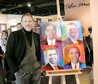
Peter Max is what one may call a genius of color. Almost every one of his paintings and designs are filled with an array of bright, loud colors which are shouting for attention. Max, whose work ranges from politics to music and sports, uses color to emphasize and enhance the item which he is painting.

In one of his newer pieces “Obama 44”, Max painted 44 portraits of Barack Obama in multi-colored panels. The piece, which honors America’s 44th president, looks Andy Warhol-esque with multiple panels featuring the same picture but with the varying element of color. Max is able to create unity through varied repetition in this painting by using variations of color on a constant theme of portraits of the same person. Max’s painting is fun yet remains aesthetically pleasing because of his differentiating color scheme.

Max also uses a grid as a tool for organizing a framework for his painting. Max’s grid has the underlying feeling of a checkerboard; the 44 portraits are assembled into four rows and ten columns, creating an overall rectangular shape. The unpredictable rhythm of color gives interest to the organized and simple layout of the painting. Because an individual portrait of Barack Obama may seem ordinary, Max uses a variety of colors and a multitude of paintings to create attention and invite the viewer to look more closely at his piece. “Obama 44” is a great example of visual unity because the whole piece predominates over the individual parts. Although when one looks closely, he or she can appreciate the uniqueness and quality of each portrait.

Peter Max, like any designer, effectively knows how to achieve unity in order to create visually pleasing and remarkable works of art.
Wednesday, October 21, 2009

Copyright of Copywrong?


In the reading The Etemology of Design, author Kostas Terzidis argues that “the notion of design…is associated with the past instead of the future.” (p.72) Designers often look to already existing items for inspiration, transforming and building off of what already exists to create something of their own.

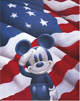
In the film Free Culture, creator Lawrence Lessig discusses how copyright laws have become an issue to designers all over the world. Lessig contends that copyright laws slow down culture from changing. Almost all forms of media, especially images, are under copyright laws which forbid any other person besides the owner from using the material. Congress has now extended copyright to 70 years beyond the lifespan of a creator, making it extremely difficult for designers to keep up with the times and improve things happening in the now. Disney, a very influential corporation, has become a pioneer for copyright laws. Every time the copyright on Mickey Mouse is close to expiration, Congress extends the copyright allowing Disney to hold on to it’s trademark character. These laws have made it so Mickey Mouse and all of Walt Disney’s creations are impossible for a designer outside of the corporation to improve on. Because Disney is so influential in society, designers are held back from impacting a large scope of people.

Creativity and innovation build on the past. When designers are not allowed to temper and improve on past ideas, they are held back. When designers are held back, so is society. Designers are crucial in order to help society change and improve. When held back by laws, the designer’s potential to advance and better the world is hindered greatly.

Wednesday, October 14, 2009

Mamela


The design process requires more listening and learning than it does creating. In order to be a successful designer, one must have an open mind and accepting attitude when working with others.

In the working world of design, a designer usually has colleagues, as well as multiple clients. It is crucial for a designer to listen to client’s needs as well as the suggestions and criticisms of the designer’s team. If a designer proceeds to do this in his or her career, he or she will be extremely successful.

By listening carefully and collaborating with clientele, the designer can effectively grasp and execute the client’s idea. Although the final product may not be exactly what the designer thinks is best, the client is happy, which is what matters in the end. A designer must also look to his or her colleagues for guidance and feedback. An outside point of view or a critique is beneficial to any designer. Advice and evaluation from others can lift a designer to reaching a point in his or her work that is beyond expectation.

Julie Taymore, the award winning designer of The Lion King musical, understands the importance of listening to others ideas, as well as your own. In an industry needing hundreds of people to put on a production, Taymore learned to utilize her team in order to create an award winning masterpiece. A current theme throughout the incredibly designed musical of The Lion King is listening to the guidance of others. The South African Sesotho word “Mamela,” which means to listen, is used continuously in Taymore’s songs. It is possible Taymore was inspired by her own experiences as a designer, and incorporated them into her beautiful portrayal of The Lion King.

Applying McCloud’s 6 Steps of Design


In Understanding Comics, author Scott McCloud presents six steps that are involved in the design process:
1. Idea/Purpose
2. Form
3. Idiom
4. Structure
5. Craft
6. Surface
It is easiest to understand these six steps by using an example, for instance, a glass vase.

First, the designer’s idea to make a vase derives from a purpose, say, needing a place to put flowers. Once the purpose has been established, one can move to the second step of form. The designer then makes the decision of what materials to use, in this case that material is glass. Third is idiom, or the genre; will this glass vase be modern or baroque? Once the style is decided, the designer begins the process of “mark making”, or designing the glass vase. The shape of the vase will be determined by the idiom, as well as the first and second steps of the idea and form. Next is crafting, blowing the glass to its designated shape, color, form and texture (all which were thought out in pervious steps). Lastly, the surface; the finished product, the glass vase itself.

While reviewing the steps of the design process, one can say that the individual decisions within each step pave the path for the next step. It is not possible for a designer to skip steps within the process of design. An excluded step can and will result in an unfinished product. This does not mean that designers do not rearrange certain steps or come back to previous steps if necessary. The flow of the design process is up to the individual designer, ultimately doing whatever he or she feels is natural in order to be successful in the journey of design.

A Designer’s Greatest Muse is Simply, Nature


What better inspiration can one find than the natural elements surrounding his or her environment? Nature’s possibilities are endless, so designers should take the opportunity to explore the diversity of the natural world, for “looking is the primary education for any artist.” (Lauer, 15). Not only can a designer seek organic guidance from plants and animals, but in inanimate objects such as the weather or geography.

Sculptor Henry Moore has clearly grasped the idea of looking to the environment for inspiration. While taking a stroll on a beach collecting seashells, Moore found a shell that embraced the idea of his existing sculpture of a mother holding a child. Although his work is similar to the shell, it is nowhere close to being a duplicate. A designer takes the insight nature provides, then contorts and guides that inspiration into his or her own unique piece of work.

A designer should look closely and carefully at their surrounding environment, for even the smallest details can provide a wide variety of thought. Objects that are routinely seen often go unnoticed, yet they have just as much potential. A designer should be constantly aware of his or her surrounding elements; as attentiveness increases, so does capability to create.

Sunday, October 11, 2009

Design of a Fine Wine?


Upon visiting Moraga’s Amaroma Restaurant, one can see the enormous display of wine bottles that take up an entire wall of shelving. How is a person to pick a wine when there are over two hundred options, all fair priced and all said to be delicious? The answer is simple, the label.

The physical presentation of the wine bottle is almost as important as the wine itself. A great label draws the eyes attention to that particular bottle, making the wine more prominent than the hundreds around it. Color and logo play an important role in acquiring awareness. For instance, “Seven Daughters” uses bright colored circles against a clean white background to attract attention to the wine. Amongst many other bottles, “Seven Daughters” bold yet simple label stands out, and therefore is more likely to be tried by consumers. Because the bottle is appealing to the eye, it becomes appealing to the appetite. Just like Sam I Am will not eat eggs just because they are green in Dr. Seuss’s “Green Eggs and Ham,” most consumers will not try something if it is not aesthetically pleasing. The design of a wine label plays a huge factor when people are deciding between wines.

The outside design of the bottle is just as important as grapes on the inside!

de Young’s Toward Abstraction


At San Francisco’s de Young art museum in Golden Gate Park, is an excellent exhibition called Toward Abstraction: Photographs and Photograms. This exhibit is filled with purely abstract black and white photos from artists such as Arthur Siegel and Robert Mapplethorpe. Since color is a void, the use of light, shadow, and shape play important roles in each of the pictures in the exhibit.

Arthur Siegel’s contribution to the exhibit consisted mostly of photograms. One work that specifically stands out is “RCS Building,” a photogram of a building in New York City. The white streaks of what appear to be light, highly contrast with the dark buildings of the city. The photogram effect almost makes the building appear as if it is moving due to a powerful source that cannot be seen.

Robert Mapplethorpe’s photographs in Towards Abstraction can be generalized as confrontational and slightly erotic. His focus on the human anatomy puts the audience at a slightly uncomfortable level, for his pictures are not shy of nudity. Although one may consider Mapplethorpe’s pictures as provocative, his use of shadow and shape on the human body are extraordinarily stunning. His picture “Back” utilizes shadow to emphasize the beauty of the muscular physique of a man.

What is Design?


The real question is, what is not design? Anywhere one looks, one can find design; from the mug that holds your morning coffee, to the ruffled white shirt you wear to work.
Both the Greek and Latin etymology of design directly proves the speculation that design is everything and everywhere. In Kostas Terzidis’s The Etymology of Design, Terzides picks apart the history of design’s linguistic form to explain that “design signifies not only the vague, intangible, or ambiguous, but also the strive to capture the elusive.” (page 69) Ironically, design is often overlooked because of the fact that it is present everywhere. Most people do not notice the design of everyday objects. In reality, every shape, color, and texture of one’s surrounding environment has been specifically designed to serve a purpose; whether that purpose is for aesthetics and/or convenience is up the designer.

Design is not only functional, but a way to express one’s inner self. Both the designer and the consumer are able to communicate a part of their personality and taste through designs. Take a glass vase for instance. The designer gets to personally choose what the vase looks like, while the consumer gets to choose, from various designed vases, the one that best fits their personal taste. By designing or buying a certain type of vase, one’s personal preference, and therefore personality, can be revealed.