Sunday, November 1, 2009

A Symbol for Change


In the 2008 election for presidency, candidate Barack Obama used a wide variety of campaigning tools which eventually led him to victory. A common symbol Obama used during his campaign was a sun rising (see picture at right), and this symbol will continue to represent him throughout his time in office and beyond. Through Peirce’s study in semiotics, one can assume that this symbol is now directly associated with Obama, regardless that it looks or says nothing about him.

The silhouette of the symbol is an O, which alludes to the O in Obama. The rising sun represents a new day, or for America, a new beginning. Obama’s intention for the design was to evoke a sense of renewal and suggest a rebirth of America and its policies. The color used in the design was obviously red, white, and blue; although Obama’s logo used a lighter blue and a brighter red which makes the design look more playful and fresh.

In order to create unity, the symbol plays with continuity. The blue sky and the red land form a perfect circle, the eye is “carried smoothly from one form to another” making the overall shape of the design look cohesive (Design Basics, 38). The negative space in the logo ties the design together, as well creates the effect of the sun and gives dimension to the land. The red and white stripes, which allude to the stripes on the American flag, appear to extend through the design and continue effortlessly onto the white background.

Overall, Obama’s symbol ties together the American flag and the idea of a new beginning. Together, these two suggestions create a visual reference to Obama’s ideas about change.

Take Me Out to the Ballgame!


The design of every major league baseball field is almost always the same: four bases, a pitcher’s circle and mound, dirt in the infield, and grass in the outfield. What is unique and important about a stadium are the components encasing it. What makes a stadium truly special to visit is not the actual field where the game is played, but all elements surrounding the field. Baseball and America go hand in hand, so a field not only represents a sport but a true American tradition.

Each stadium across the United States design is undeniably beautiful and distinct to its city. The Boston Red Sox’s Fenway Park opened in 1912, and still remains a classic with its well-known wall, the Green Monster. The Green Monster is a 37 foot wall in the left field of Fenway, where the only manual scoreboard left in major league baseball is mounted. The wall is the focal point of the stadium because of its extreme proportion in relation to all other fields in the United States. Although the wall is a defining characteristic, the design is very impractical for a baseball field because it prevents many homeruns and is extremely problematic for left fielders.

In contrast to Boston’s classic field, New York’s Yankee stadium is brand new and filled with glamorous restaurants and high tech gadgets, and holds up to 52,000 people. The original stadium which sits across the street held many great memories for the Yankees, so designers brought elements of the old into the new. The salient lattice work from the old stadium was recreated and put on the roof of the new stadium. The interior of the stadium has thousands of photographs portraying Yankee history which raise spirit and bring nostalgia to Yankee fans. The photographs in the new stadium are important because they remind fans of the strength of old Yankee players and tradition.

Every stadium design, new or old, has its own charm and character. The importance of design in baseball fields helps fans distinguish a special trait in their team’s stadium to be proud of. Whether it be a giant Coke bottle like the San Francisco Giants’ AT&T Park or a big bell that lights up for homeruns in Philadelphia’s Citizens Bank Park, each design in uniquely important to a team’s fans and its players.

LOVE


Almost every night in the Mirage hotel in Las Vegas, hundreds of people go to see the Cirque du Soleil show LOVE. About the journey of the popular rock group the Beatles, LOVE uses acrobatics, music, and vibrant color to evoke a sense of the 60’s and show stories through the Beatle’s songs.

Before going into the theatre, one can immediately get a sense of the show, even if they have no clue who the Beatles are. The walkway into lobby is made of board tile LED lights which change colors in a wave-like effect. The rest of the lobby is all white and very modern with clean lines and simple architecture. Because the majority of the lobby is very simple, it allows the eye to concentrate on the floor feature, which is essentially the focal point. The floor even extents to a half wall where there is a silhouette of the four Beatles jumping in the air. The floor leads the eye down the path of colors all the way up the wall to showcase the picture of the Beatles. This light feature perfectly defines the essence of the LOVE show with its’ bright colors and rock n’ roll vibe.

The actual show of LOVE is almost indescribable. The overall design for the show could be easily stated as organized chaos. Flamboyant and intricate costumes combined with an incredibly colorful set design are almost overwhelming. Along with music that fills your heart with happiness and astounding acrobatics, watching the show feels almost like one is on a mindboggling drug trip. Every sense must be utilized while watching LOVE because there is so much color, sound, and action to take in. One might even get lost in the show and feel as if he or she is in another world. Because the design elements are so overpowering and bold, LOVE becomes more of an experience and a journey than just a story.

Monday, October 26, 2009

Peter Max


Peter Max is what one may call a genius of color. Almost every one of his paintings and designs are filled with an array of bright, loud colors which are shouting for attention. Max, whose work ranges from politics to music and sports, uses color to emphasize and enhance the item which he is painting.

In one of his newer pieces “Obama 44”, Max painted 44 portraits of Barack Obama in multi-colored panels. The piece, which honors America’s 44th president, looks Andy Warhol-esque with multiple panels featuring the same picture but with the varying element of color. Max is able to create unity through varied repetition in this painting by using variations of color on a constant theme of portraits of the same person. Max’s painting is fun yet remains aesthetically pleasing because of his differentiating color scheme.

Max also uses a grid as a tool for organizing a framework for his painting. Max’s grid has the underlying feeling of a checkerboard; the 44 portraits are assembled into four rows and ten columns, creating an overall rectangular shape. The unpredictable rhythm of color gives interest to the organized and simple layout of the painting. Because an individual portrait of Barack Obama may seem ordinary, Max uses a variety of colors and a multitude of paintings to create attention and invite the viewer to look more closely at his piece. “Obama 44” is a great example of visual unity because the whole piece predominates over the individual parts. Although when one looks closely, he or she can appreciate the uniqueness and quality of each portrait.

Peter Max, like any designer, effectively knows how to achieve unity in order to create visually pleasing and remarkable works of art.

Wednesday, October 21, 2009

Copyright of Copywrong?


In the reading The Etemology of Design, author Kostas Terzidis argues that “the notion of design…is associated with the past instead of the future.” (p.72) Designers often look to already existing items for inspiration, transforming and building off of what already exists to create something of their own.

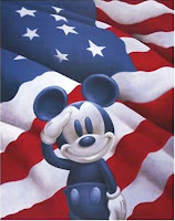
In the film Free Culture, creator Lawrence Lessig discusses how copyright laws have become an issue to designers all over the world. Lessig contends that copyright laws slow down culture from changing. Almost all forms of media, especially images, are under copyright laws which forbid any other person besides the owner from using the material. Congress has now extended copyright to 70 years beyond the lifespan of a creator, making it extremely difficult for designers to keep up with the times and improve things happening in the now. Disney, a very influential corporation, has become a pioneer for copyright laws. Every time the copyright on Mickey Mouse is close to expiration, Congress extends the copyright allowing Disney to hold on to it’s trademark character. These laws have made it so Mickey Mouse and all of Walt Disney’s creations are impossible for a designer outside of the corporation to improve on. Because Disney is so influential in society, designers are held back from impacting a large scope of people.

Creativity and innovation build on the past. When designers are not allowed to temper and improve on past ideas, they are held back. When designers are held back, so is society. Designers are crucial in order to help society change and improve. When held back by laws, the designer’s potential to advance and better the world is hindered greatly.

Wednesday, October 14, 2009

Mamela


The design process requires more listening and learning than it does creating. In order to be a successful designer, one must have an open mind and accepting attitude when working with others.

In the working world of design, a designer usually has colleagues, as well as multiple clients. It is crucial for a designer to listen to client’s needs as well as the suggestions and criticisms of the designer’s team. If a designer proceeds to do this in his or her career, he or she will be extremely successful.

By listening carefully and collaborating with clientele, the designer can effectively grasp and execute the client’s idea. Although the final product may not be exactly what the designer thinks is best, the client is happy, which is what matters in the end. A designer must also look to his or her colleagues for guidance and feedback. An outside point of view or a critique is beneficial to any designer. Advice and evaluation from others can lift a designer to reaching a point in his or her work that is beyond expectation.

Julie Taymore, the award winning designer of The Lion King musical, understands the importance of listening to others ideas, as well as your own. In an industry needing hundreds of people to put on a production, Taymore learned to utilize her team in order to create an award winning masterpiece. A current theme throughout the incredibly designed musical of The Lion King is listening to the guidance of others. The South African Sesotho word “Mamela,” which means to listen, is used continuously in Taymore’s songs. It is possible Taymore was inspired by her own experiences as a designer, and incorporated them into her beautiful portrayal of The Lion King.

Applying McCloud’s 6 Steps of Design


In Understanding Comics, author Scott McCloud presents six steps that are involved in the design process:
1. Idea/Purpose
2. Form
3. Idiom
4. Structure
5. Craft
6. Surface
It is easiest to understand these six steps by using an example, for instance, a glass vase.

First, the designer’s idea to make a vase derives from a purpose, say, needing a place to put flowers. Once the purpose has been established, one can move to the second step of form. The designer then makes the decision of what materials to use, in this case that material is glass. Third is idiom, or the genre; will this glass vase be modern or baroque? Once the style is decided, the designer begins the process of “mark making”, or designing the glass vase. The shape of the vase will be determined by the idiom, as well as the first and second steps of the idea and form. Next is crafting, blowing the glass to its designated shape, color, form and texture (all which were thought out in pervious steps). Lastly, the surface; the finished product, the glass vase itself.

While reviewing the steps of the design process, one can say that the individual decisions within each step pave the path for the next step. It is not possible for a designer to skip steps within the process of design. An excluded step can and will result in an unfinished product. This does not mean that designers do not rearrange certain steps or come back to previous steps if necessary. The flow of the design process is up to the individual designer, ultimately doing whatever he or she feels is natural in order to be successful in the journey of design.